Colour is a powerful marketing tool – it is the first thing that people see, registering in the human brain before typography and images. Colour has been known to have a powerful psychological impact on people’s behaviour and decisions, and can often be the sole reason someone purchases a product. Given this, using the right colours in your signage and marketing collateral is of the utmost importance, so depending on the message you are trying to send and the response you are wishing to evoke there may be particular colours that you should be using.
Colours and How They Influence People
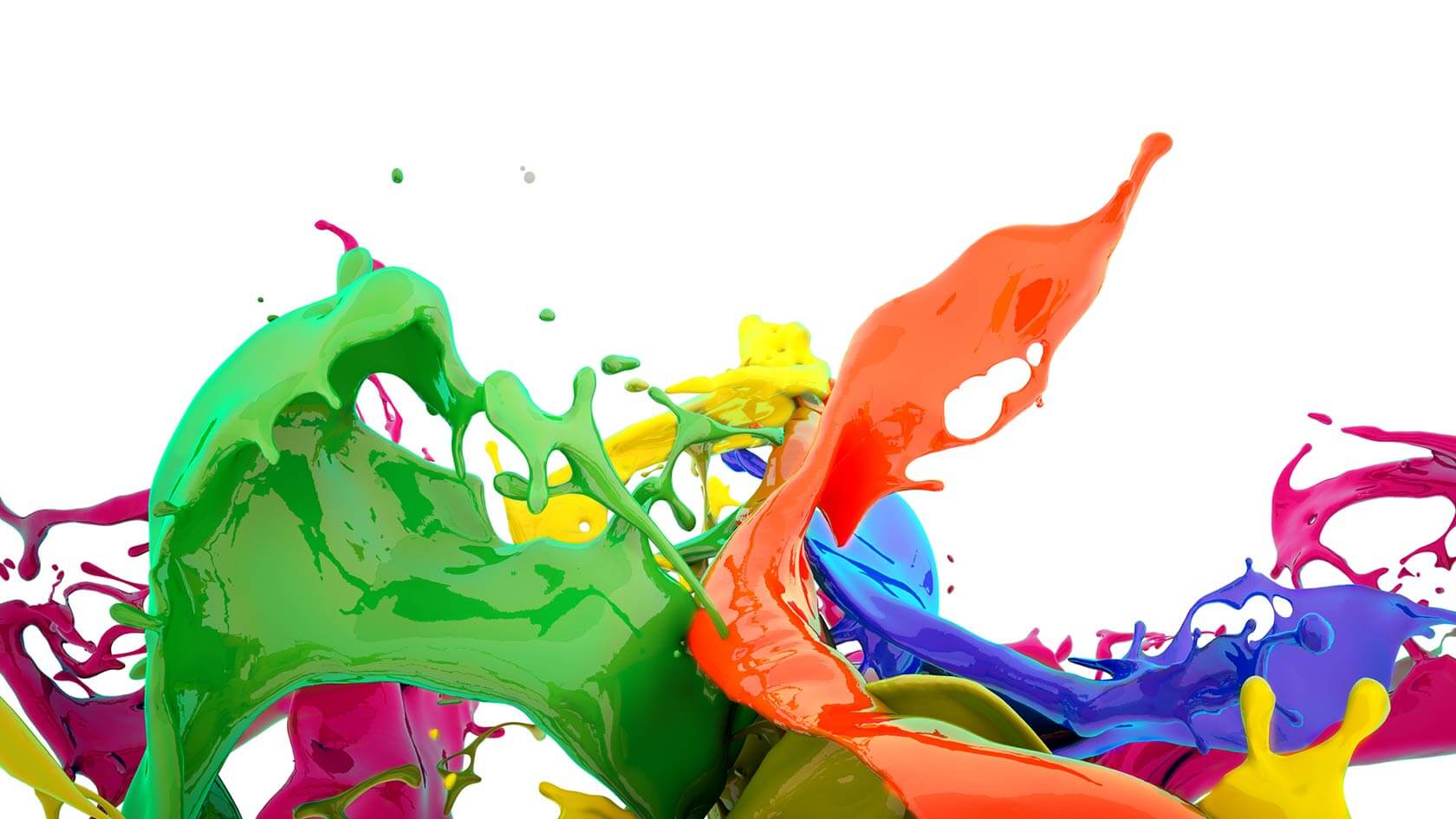
- Red– power and passion. It has a lot of energy associated with it, is considered bold and creates a sense of urgency which is great for impulse buyers and sales. It can trigger hunger, and is also arousing and desirable, physically affecting the body by raising blood pressure and heart rate.
- Blue– logic, communication, peace, tranquillity and reliability. The colour blue is also associated with nature, both water and sky, giving it a calming and peaceful effect. Blue promotes a sense of reliability and trust and it may induce a calming effect on the body, making us feel safe and secure.
- Green– health, tranquillity and nature. Green represents balance and harmony and is often used to stimulate a sense of relaxation and to promote environmental issues. It is associated with peace, earth and universal love. Dark green is often associated with wealth and money.
- Yellow and Orange – happiness, optimism, fun, playfulness. Friendly and sociable colours, invoking feelings of excitement, cheerfulness and well-being. Also associated with high energy, youthfulness and enthusiasm. These colours grab your attention and can also be a sign for caution. They may also be used to create a sense of anxiety that can draw impulsive buyers and window shoppers.
- Purple– royalty, wisdom, and respect. Purple has long been associated with royalty, and since it’s not a dominant colour in nature, it stimulates creativity and imagination. Often associated with luxury and decadence.
- Black– powerful and sophisticated. Black is seen as a status symbol and carries an air of exclusiveness. It is seen as elegant and glamorous. Also associated with authority, power, stability, and strength and may often be a symbol of intelligence.
- White – pure, clean, and safe. White is associated with sincerity, peacefulness, and simplicity. It can also be used to spark creativity when viewed as a clean slate. White is typically paired with black in an attempt to portray balance and harmony.
How to Use Colour to Attract Attention
Colour should be carefully considered when being used to grab attention. A great way to think about this is to think of person in a red dress in a room full of grey suits. They will stand out strongly, however if everyone else is wearing red, the dress will be less noticeable. Within signage or other marketing collateral, have one main area of colour to grab the eye from the start, then offer a direction away from this via more muted colours. Using contrast will help your intended colour, and therefore your message, stand out.
Need more advice? Ausign is a Melbourne signage company providing local companies and interstate businesses with quality banners and signs for over 30 years – so we know a thing or two about what makes a great sign stand out from the rest! For prompt assistance with all your signage needs, visit our office at 346 Johnston Street in Abbotsford, call us on (03) 9419 0970 or fill out an online contact form.